


Anatomy is often a complex web of overlapping tissues, bones, and tendons. For students of biology and medicine, the challenge lies in deconstructing these dense structures into manageable, identifiable parts. One effective way to master this is through the use of stylized anatomical maps. Unlike high-resolution medical photography, which can sometimes be overwhelming due to the sheer amount of visual data, a stylized diagram prioritizes clarity and spatial relationships.
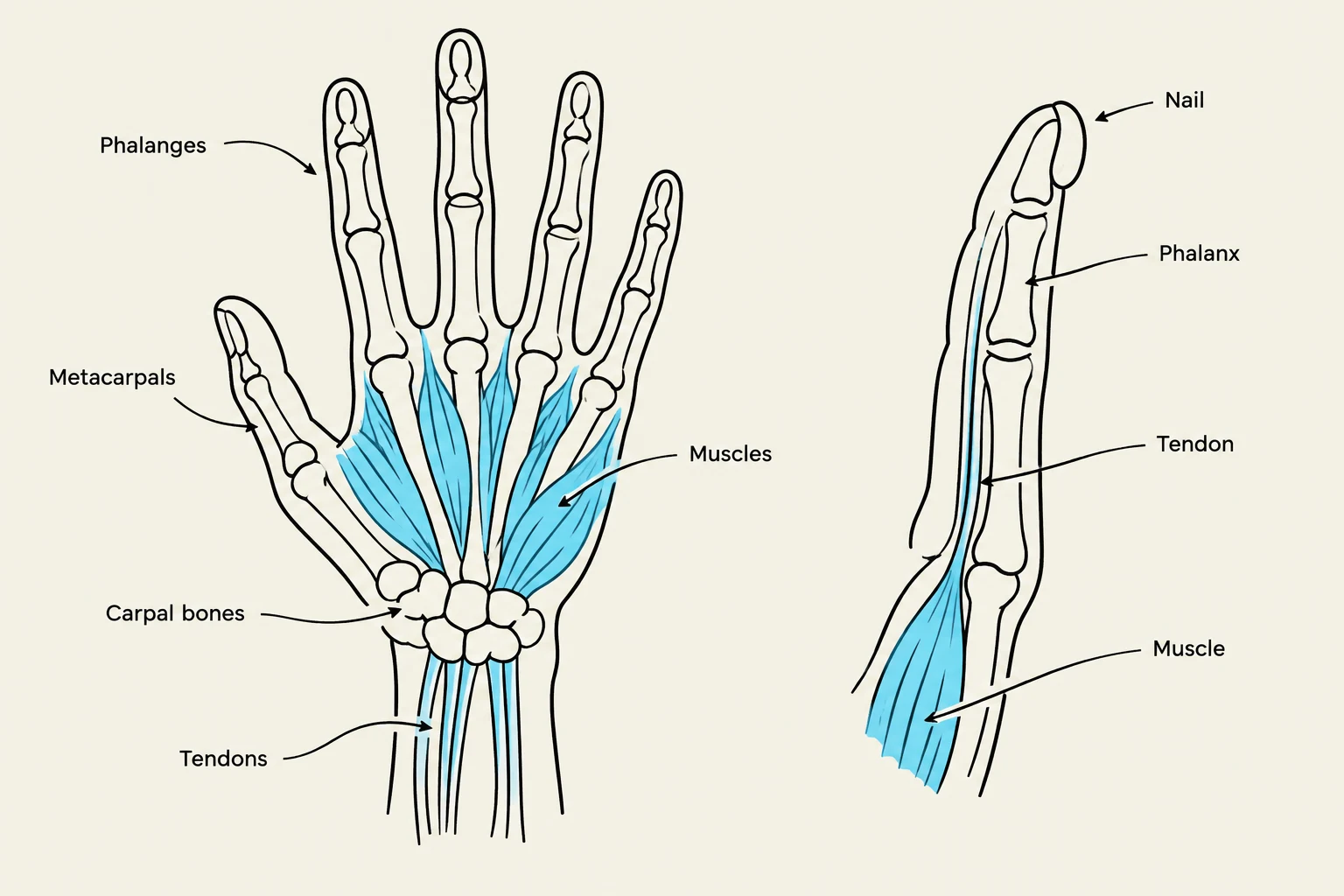
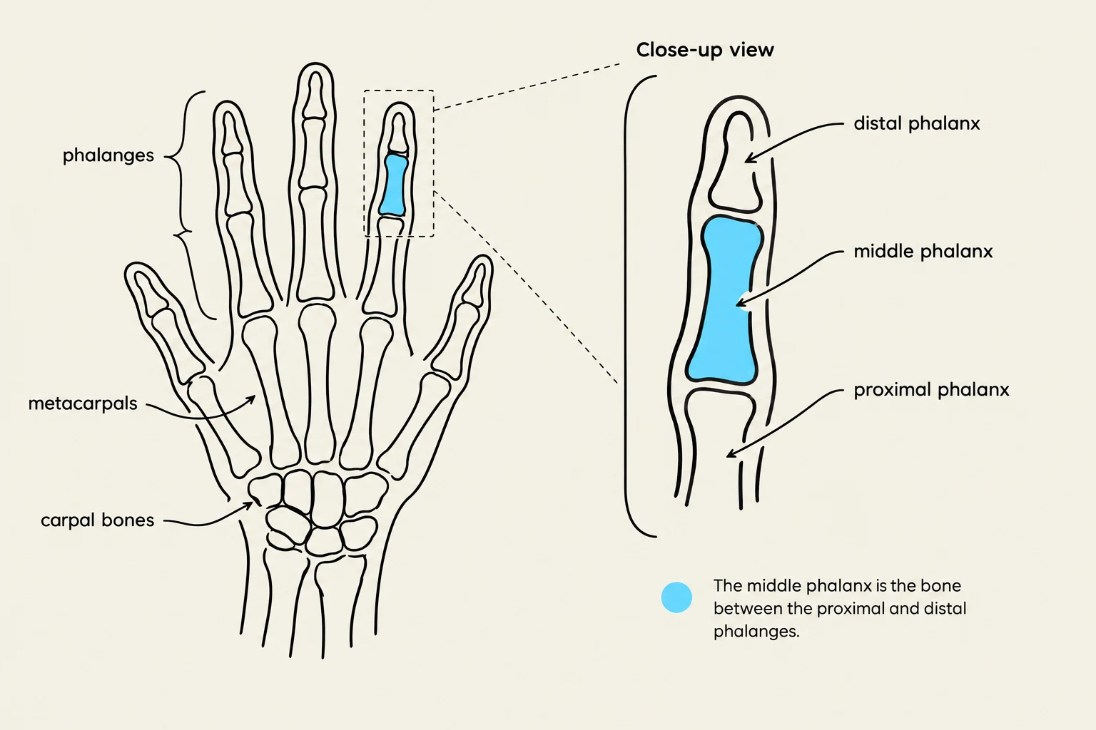
The Hand Anatomical Diagram Map is a specialized educational tool designed for this exact purpose. It utilizes a "MAP IT" approach, where a hand-drawn, simplified view of human hand or finger structures is used to bridge the gap between abstract anatomical names and their physical locations.
The Logic of Stylized Anatomical Mapping
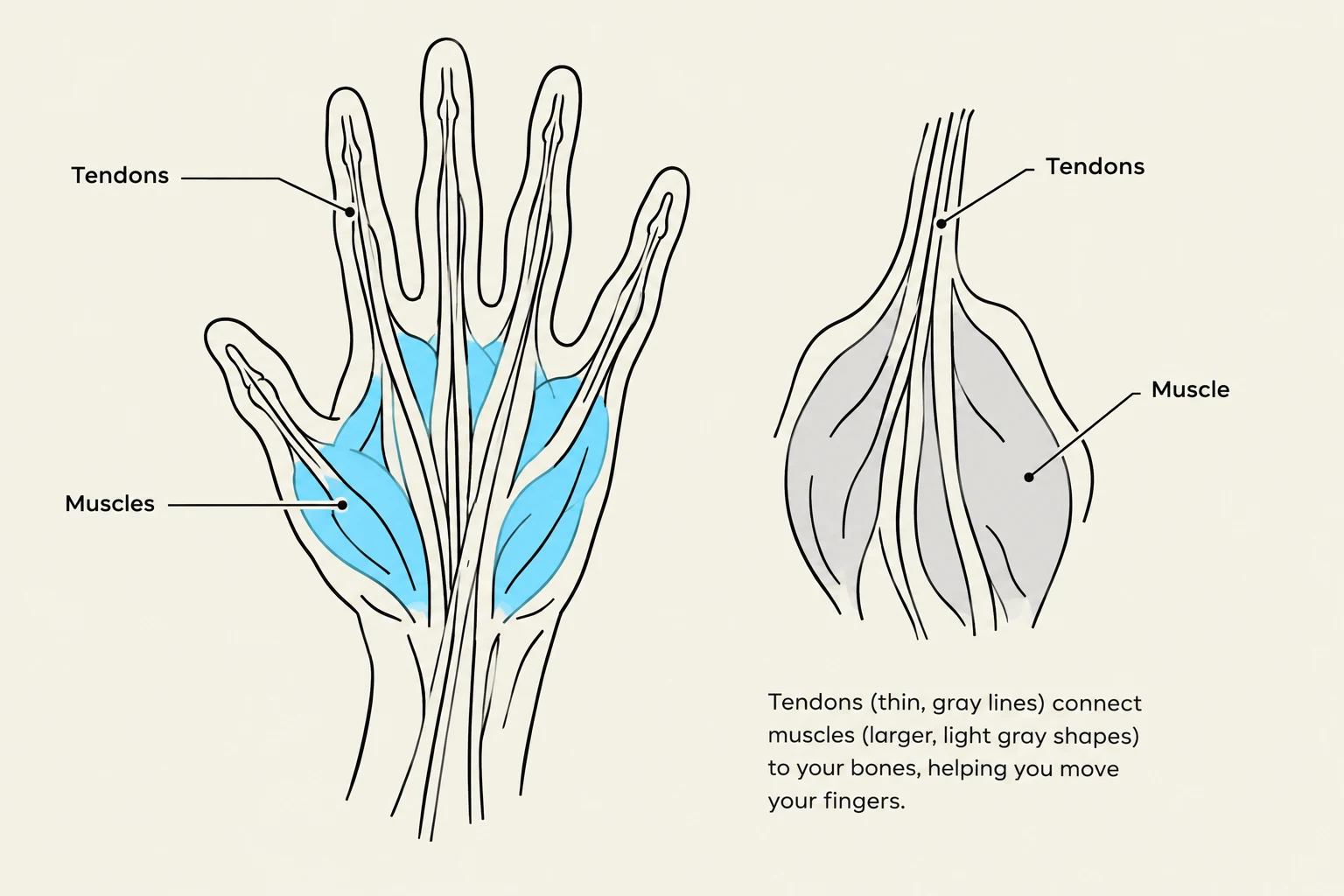
When studying the human hand structure, it is easy to get lost in the minute details of every single fiber. A stylized diagram, such as the one presented in the "MAP IT" exercise, uses varying shades of gray to distinguish between different anatomical components.
By using different tones, the map can separate hard structures (like bones) from soft tissues (like tendons or fat pads) without needing a full spectrum of color. This monochromatic approach forces the student to focus on shape, contour, and the spatial arrangement of the parts.
Study Tip: When looking at a grayscale anatomical map, always identify the darkest and lightest areas first. Darker, more defined lines often represent tendons or boundaries, while larger, lighter shapes typically represent bones or larger muscle masses.
Keep reading for free.
Create an account to finish this reading and make it part of your study routine.
Continue reading freeAlready have an account? Log in
Updated