Learn about bivariate data analysis, including independent and dependent variables, scatter plots, correlation coefficients, and linear regression to find the line of best fit. Understand interpolation and extrapolation for making predictions.
Understanding Linear Regression and Bivariate Data
In the world of statistics, we often want to know if one thing affects another. Does the temperature of a room affect the amount of electricity used for cooling? Does the amount of time spent studying affect exam scores? To answer these questions, we use Bivariate Data Analysis. While univariate analysis looks at a single variable, bivariate analysis examines the relationship between two different variables to see if they move together in a predictable way.
Bivariate Data: The Independent and Dependent Variables
When analyzing two variables, we must first identify their roles. In a bivariate data set, we distinguish between the independent variable (x) and the dependent variable (y).
Independent Variable (x): This is the variable that is controlled or changed to observe its effect. It is often thought of as the "cause."
Dependent Variable (y): This is the variable being tested and measured. Its value "depends" on the changes made to the independent variable. It is the "effect".
For example, if we are investigating the relationship between temperature and atmospheric pressure, temperature is the independent variable (x) because we observe how pressure changes as temperature fluctuates.
Visualizing Data with Scatter Plots
Before performing complex calculations, the first step in bivariate analysis is to create a scatter plot. A scatter plot is a graph where individual data points are plotted on a coordinate plane. By looking at the "cloud" of points, we can visually detect patterns, trends, or a lack of relationship.
Depending on how the points are distributed, we might see different types of correlations:
Strong Positive Correlation: The points trend upwards from left to right. As x increases, y also increases.
A scatter plot showing a strong positive correlation, indicated by the text "r → +1".
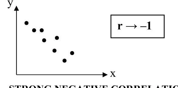
Strong Negative Correlation: The points trend downwards from left to right. As x increases, y decreases.
A scatter plot illustrating a strong negative correlation, where the correlation coefficient 'r' approaches -1.
No Relationship: The points are scattered randomly with no discernible pattern.
A scatter plot showing no correlation between variables x and y, indicated by r=0.
Note: Sometimes data follows a curve rather than a straight line. This is known as a non-linear correlation.
A scatter plot illustrating non-linear correlation between variables x and y.
The Correlation Coefficient (r)
To move beyond visual estimation, we use the correlation coefficient, denoted as r. This numerical value measures both the strength and the direction of the linear relationship between two variables.
The value of r is always constrained within the following range:
−1≤r≤1
An r value close to +1 indicates a strong positive linear relationship.
An r value close to −1 indicates a strong negative linear relationship.
An r value close to 0 indicates little to no linear relationship.
Linear Regression and the Line of Best Fit
When a strong linear relationship is identified, we use Linear Regression to find the mathematical model that best describes the data. This model is called the line of best fit.
The equation for the line of best fit is expressed as:
$y = A + Bx$
In this equation:
A is the y-intercept (the value of y when x=0).
B is the gradient or slope (the rate at which y changes for every unit increase in x).
Worked Example: Temperature and Pressure
Imagine we have the following data regarding temperature (x) and atmospheric pressure (y):
Temperature (x)
Pressure (y)
10
100.3
15
100.5
20
101.0
25
101.1
30
101.4
A scatter plot showing the relationship between temperature and atmospheric pressure.
By inputting this data into a scientific calculator's regression mode, we can determine the specific values for A and B to create our prediction model.
Making Projections: Interpolation vs. Extrapolation
Once we have our line of best fit, we can use it to predict values. These predictions are categorized into two types:
Interpolation: This is predicting a value that falls within the range of the original data set. For example, using our temperature data to predict the pressure at 18∘C is interpolation.
Extrapolation: This is predicting a value that falls outside the original range of the data. For example, using our data to predict the pressure at 50∘C is extrapolation.
Caution: While interpolation is generally reliable, extrapolation can be risky because we are assuming the linear pattern continues indefinitely beyond our observed data, which may not always be true in real-world scenarios.
Using a Scientific Calculator
For students using a Casio fx-991ZA PLUS II, these calculations are streamlined through the STAT and REG menus.
Enter Data: Switch to MODE 3: Statistics, select 2: A+BX, and enter your x and y values into the table.
Find r, A, and B: Use the REG sub-menu to find the correlation coefficient (r), the y-intercept (A), and the gradient (B).
Predict Values: Use the estimation functions (often labeled x^ or y^) to perform interpolation and extrapolation quickly.
If your results involve very large or very small numbers, ensure your calculator is set to the correct Scientific Notation mode. You can adjust this via SHIFT MODE to choose between Norm 1 (uses scientific notation for small numbers) or Norm 2 (uses standard decimals unless the number is extremely small).
Keep reading for free.
Create an account to finish this reading and make it part of your study routine.