Learn about descriptive statistics, including measures of central tendency (mean, median, mode), measures of variation (variance, standard deviation), and graphical methods like box plots. Understand the difference between parameters and statistics, and how to identify outliers.
In the world of data science and analytics, we often face massive amounts of information that can feel overwhelming. To make sense of this chaos, we use descriptive statistics. Descriptive statistics involve using tabular, graphical, and numerical methods to summarize data and uncover the relationships between different variables. By applying these techniques, we can transform a raw list of numbers into a meaningful story about the world.
Parameters vs. Statistics: The Big Picture
Before diving into specific calculations, it is crucial to understand the distinction between a population and a sample. In statistics, we are often interested in a population—the entire group of individuals or items we want to study. A number that describes a characteristic of this entire population is called a population parameter.
However, because populations are often too large to measure entirely, we frequently study a sample—a smaller subset of the population. A number calculated from these sample measurements is known as a sample statistic.
Exam Tip: Remember the "P" and "S" rule. Parameters describe the Population, while Statistics describe the Sample.
Measuring the Center: Central Tendency
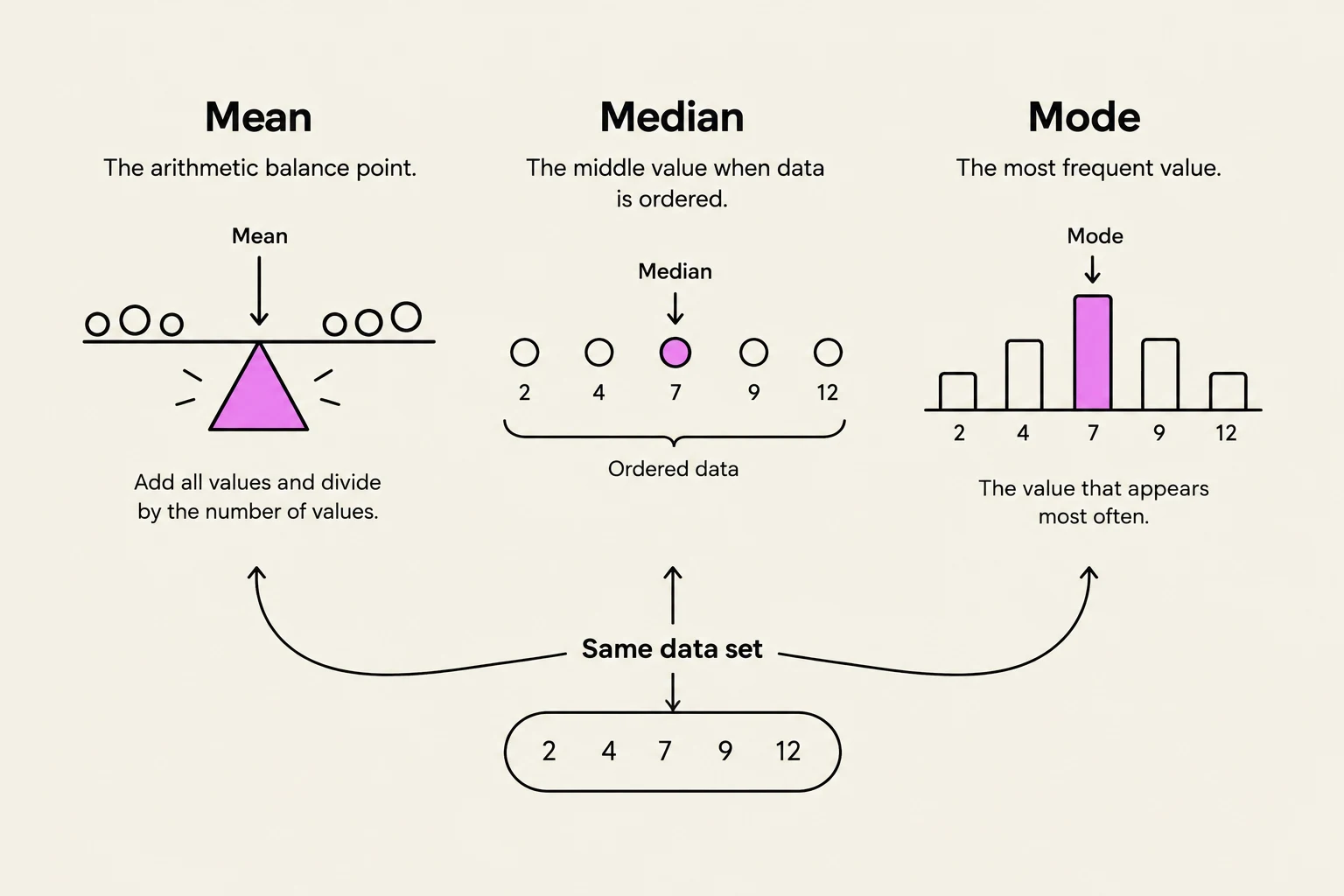
One of the primary goals of descriptive statistics is to find the "center" of a data set, a concept known as central tendency. There are three common measures used to identify this center: the mean, the median, and the mode.
The Mean (The Average)
The mean is the most widely understood measure of center. To find the population mean (μ), you add all the population measurements and divide by the total number of observations (N):
μ=N∑i=1Nxi
If you are working with a sample, you calculate the sample mean (xˉ) using the sample size (n):
xˉ=n∑i=1nxi
The Median (The Middle)
The median (Md) is the middlemost value in a data set when the observations are arranged in increasing order.
If the number of observations is odd, the median is the exact middle value at position (n+1)/2.
If the number of observations is even, the median is the mean of the two middle values.
The Mode (The Peak)
The mode (Mo) is the value that occurs most frequently in a data set. Unlike the mean and median, a data set can have more than one mode:
Unimodal: One clear peak.
Bimodal: Two distinct peaks.
Multimodal: Three or more peaks.
This illustration explains the concepts of mean, median, and mode using a sample data set. The mean is depicted as the balance point of a scale, the median as the middle value in an ordered data set, and the mode as the most frequent value represented by a bar chart.
Outliers and Resistant Measures
Not all measures of center are created equal. The mean is very sensitive to outliers—extreme data values that are far from the rest of the observations. For example, if you are looking at NBA salaries, a few players earning over $33 million can pull the "average" (mean) much higher than what a typical player actually earns.
Because of this sensitivity, we distinguish between "sensitive" and "resistant measures":
The Mean is NOT resistant: A single massive outlier can drastically change the mean.
The Median and Mode ARE resistant: The median is only affected by the position of an extreme value, not its specific magnitude. The mode is only sensitive to the most frequent value and ignores everything else.
When a distribution is heavily skewed (having a very long tail to the left or right), the median is often a better representation of the "typical" value than the mean.
Measuring Variation and Spread
Knowing the center is only half the battle; we also need to know how spread out the data is. This is known as variation.
Variance and Standard Deviation
The population variance (σ2) is the average of the squared deviations from the mean:
σ2=N∑i=1N(xi−μ)2
The population standard deviation (σ) is simply the positive square root of the variance:
σ=σ2
The Empirical Rule and Z-Scores
If a population follows a normal (bell-shaped) curve, we can use the Empirical Rule to predict where data falls:
Approximately 68.2% of measurements lie within μ±1σ.
Approximately 95.4% of measurements lie within μ±2σ.
Approximately 99.7% of measurements lie within μ±3σ.
To find out exactly how many standard deviations a specific value is from the mean, we calculate a z-score:
z=σx−μ
A z-score above +3 or below −3 is often categorized as an outlier.
The Empirical Rule illustrates the percentage of data within standard deviations of the mean in a normal distribution: approximately 68% within �1��, 95% within �2��, and 99.7% within �3��.
Visualizing Data: Percentiles and Box Plots
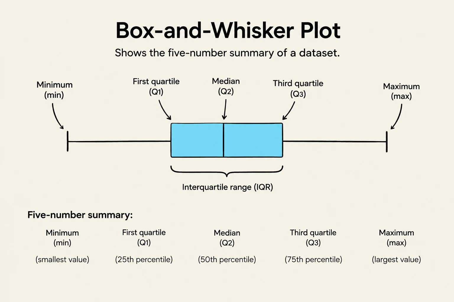
To summarize data visually, we often use the five-number summary, which includes the Minimum, First Quartile (Q1), Median, Third Quartile (Q3), and Maximum.
Percentiles: The pth percentile is the value below which at least p percent of the observations fall.
Quartiles:Q1 is the 25th percentile, and Q3 is the 75th percentile.
Interquartile Range (IQR): This measures the spread of the middle 50% of the data: IQR=Q3−Q1.
The Box-and-Whiskers Display
A box plot (or box-and-whisker display) is a graphical tool that represents this five-number summary:
The box represents the area between Q1 and Q3.
A line inside the box marks the median.
The whiskers extend to the minimum and maximum values.
Warning: When drawing box plots, if a data point is more than 1.5×IQR away from the quartiles, it should be plotted as a separate dot to indicate it is a suspected outlier.
A box-and-whisker plot illustrates the five-number summary of a dataset, including the minimum, first quartile, median, third quartile, and maximum values, as well as the interquartile range.
Summary Checklist
When analyzing a new data set, follow these best practices:
Always plot your data first (using a histogram or dot plot) to see the shape and identify outliers.
Check for symmetry: Is it mound-shaped (normal) or skewed?
Identify peaks: Is it unimodal, bimodal, or multimodal?
Choose your measures: Use the mean for symmetric data, but consider the median if outliers are present.
Keep reading for free.
Create an account to finish this reading and make it part of your study routine.