


When economists look at data, they often see patterns where two variables move together. For instance, a graph might show that as ice cream sales increase, the number of sunburns also rises. To a casual observer, this might look like a relationship where one causes the other. However, an economist must look deeper. The core challenge in economic analysis is distinguishing between a simple coincidence and a true relationship of cause and effect. Understanding how to interpret graphs without falling into common logical traps is essential for effective policy-making and decision-making.
Correlation vs. Causation
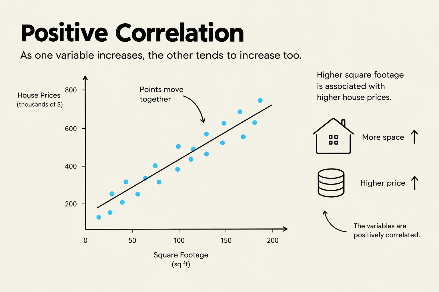
The most fundamental distinction in economic data analysis is between correlation and causation. Correlation refers to a statistical relationship where two variables move in tandem—either in the same direction (positive correlation) or in opposite directions (negative correlation). While correlation is a necessary starting point for investigation, it does not prove that one variable is responsible for the changes in the other.
Cause and effect implies a directional relationship where a change in one variable (the independent variable) directly results in a change in another (the dependent variable). In a graph, we often plot the cause on the x-axis and the effect on the y-axis, but we must be careful: the visual alignment of points does not guarantee the direction of influence.
Exam Tip: If a question asks whether a strong correlation proves a causal link, the answer is almost always "No." Always look for potential underlying factors that might be driving both variables.


Keep reading for free.
Create an account to finish this reading and make it part of your study routine.
Continue reading freeAlready have an account? Log in
Updated